AgileBrain

UX CONSULTANCY & REDESIGN PROPOSAL

AgileBrain is a neuroscience-based emotional-motivational assessment tool.

In collaboration with AgileBrain, I focused on enhancing the user experience and retention across their assessment platform, internal portal, and website. My work centered on streamlined user flows, friction reduction, improved portal usability, and a redesigned website homepage.

Go to website
Project cover of AgileBrain - assessment tool case study

Timeline

6 months

Team

  • Me as a UX/UI designer
  • Project Sponsor
  • Project manager/ Product owner (portal)
  • Marketing lead/ Product owner (website)
  • Technology lead

What I did

  • UX Consultancy
  • Assessment of products
  • Redesign proposal (wireframes)

Tools

  • Figma
  • WordPress

Agile brain user groups

AgileBrain user groups

Assessment

AgileBrain assessment case study cover

Challenges

Users faced friction within the AgileBrain assessment flow, big percentage of users drop out on the beginning of the assessment.

Solution

  • Reduce friction points in assessment flow by reducing unnecessary steps, and letting users skip instructions if they already know it.
  • Make instructions more readable and easy to skim through, by using easy to read language, adding visuals and breaking down complex instructions.
  • Highlight crucial elements for assessment completion by using clear hierarchy, color coding and progress bars to provide users with a sense of progress.

This changes can potentially increase completion and retention  rates.

Understanding the existing assessment flow and user’s feedback

To begin the project, I conducted a thorough analysis of the existing assessment experience. This involved:

  • Mapping the assessment flow
  • Analyzing user feedback: I analyzed user feedback data from AgileBrain and drop-off pages to uncover user pain points and identify areas for improvement.
Figma screenshot of existing assessment flow
Affinity map of user's feedback

Pain points

  • The assessment directions were lengthy and were text heavy.
  • Users missed some parts of the assessment as they didn't notice the prompt (The assessment is timed).
  • Users had concerns about privacy policies while answering the post-assessment questionnaire.
  • Users found it difficult to understand how to interpret the results.

My recommendations were aimed at enhancing specific pages and eliminating high-friction steps, which could potentially lead to positive user experience during assessments and can contribute to higher user satisfaction.

Optimizing the assessment flow

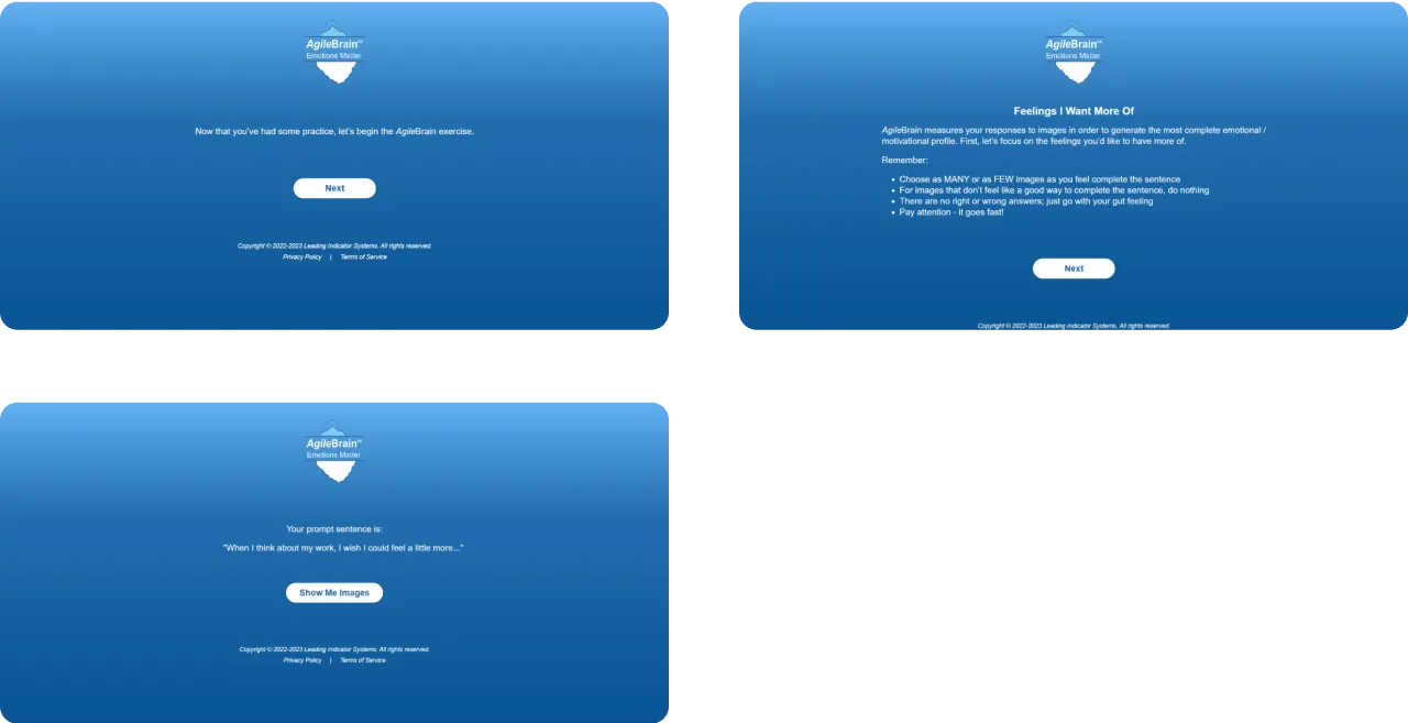
To enhance user experience throughout the assessment journey, I conducted a comprehensive analysis of the existing flow and its associated screens. Through this analysis, I identified key areas for optimization:

Existing flow opportunities for optimization

  • Unnecessary or misplaced steps.
  • Consolidation of redundant steps.
  • Flow ends without providing users with a clear next step or call to action.
Existing user flow with zones that potentially need improvement

Optimized version of a flow

  • Opportunity for returning users to skip training steps and jump to the prompt.
  • Organizing all instructional steps into a single, unified location.
  • Removing any unnecessary or redundant steps before the assessment.
  • Merging 2 steps in one to reduce the number of clicks required to access the results.
  • Adding call to action for regular users and coaches to complete the desirable actions.
  • Introducing clear and concise call-to-actions (CTAs) at the end of the assessment journey. These CTAs are tailored to the user's role:
    - Regular users: The CTA encourages them to save their results for future reference or comparison.
    - Coaches: The CTA seamlessly redirects them to the AgileBrain team to explore potential collaborations and learn more about the assessment tool.
Optimized version of user flow with improved zones

More engaging first screen to decrease drop-off rate

This page had the highest user drop-off rate. To address this, I implemented a visual overview of the available assessment types.

Each assessment type is clearly labeled and color-coded, allowing users to quickly understand the options and their content without needing to click and navigate further.

This can improve scannability and reduce cognitive load, potentially leading to a decrease in drop-off rates and increased user engagement.

Original
Original screen: first screen of the assessment
Redesign
Redesigned screen: first screen of the assessment

Enhancing navigation and user progression

To ensure users can seamlessly navigate the assessment and maintain a sense of progress, the following improvements were implemented:

  • Enhanced navigation: I introduced a "Return" button allowing users to easily revisit previous sections and modify their answers if necessary. This empowers users and minimizes frustration from feeling locked into specific choices.
  • Streamlined training: For returning users, I implemented the option to skip the introductory training. This streamlines the process for users who are familiar with the assessment structure, saving them valuable time and reducing repetition.
  • Progress visualization: A progress bar was added to provide users with a clear visual representation of their completion status throughout the assessment. Witnessing progress can foster a sense of accomplishment and motivate users to complete the entire evaluation.
Original
Original screen: screen of the assessment step, that demonstrates existing structure of the layout
Redesign
Redesigned screen: screen of the assessment step, that demonstrates improvements in navigation and page layout

Improving clarity and user engagement on the Instructions pages

To enhance clarity and user engagement on the instructions page, I added the following improvements:

  • Reorganized layout: I reorganized the layout, transforming dense text blocks into visually appealing and simple layouts. This made the page easier to scan and reduced cognitive load so that users can find the information they need more easily.
  • Concise and essential information: The texts ware rewritten to prioritize essential information, eliminating redundancy and unnecessary details. This ensures users are presented with clear and concise instructions that are easy to understand and follow.
  • Visual reinforcement: Icons were added to visually represent key concepts and instructions.
Original
Original screen: assessment instructions page
Redesign
Redesigned screen: optimized version of assessment instructions page
Original
Original screen: assessment instructions page
Redesign
Redesigned screen: optimized version of assessment instructions page

Shortening pre-assessment flow and emphasizing prompt

To enhance the user experience and streamline the process leading into the assessment, the following improvements we implemented:

  • Reduced the number of pre-assessment steps: I consolidated redundant pages and organized all instructions into a single, unified block. This eliminates unnecessary screens and minimizes the number of clicks required before users can begin the assessment.
  • Prominent prompt: The prompt sentence was placed to occupy a prominent position within the layout hierarchy. This ensures increased visibility and reduces the risk of users missing crucial instructions.
Original
Original screens: pre-assessment steps
Redesign
Redesigned screen: reduced number of pre-assessment steps to 1 screen with improved prompt positioning

Improving post-assessment questionary and privacy concerns

To ensure continued user engagement and valuable data collection after assessment completion, I proposed to implement:

  • Progress visualization: I incorporated a progress bar similar to the one implemented on the onboarding pages. This provides users with a clear visual representation of their progress throughout the post-assessment questionnaire, promoting a sense of accomplishment and motivating them to complete it.
  • Transparency in data collection: For questions involving private data, such as participation in therapy etc., we adopted a strategy of transparency and reassurance by adding the specific purpose of collecting such data.
Original
Original screen: post-assessment questionary page
Redesign
Redesigned screen: post-assessment questionary page with improved navigation and improved data collection transparency

Enhancing results clarity and user understanding

To address user feedback regarding difficulty comprehending the results page, we collaboratively worked on following improvements:

  • Reorganized page layout: We reorganized the page layout to prioritize essential information and eliminate irrelevant details. This reduces cognitive load and simplifies information navigation for users.
  • Comprehensive key: A clearly presented and comprehensive key was added to provide users with a thorough understanding of the symbols and terminology used throughout the results. This empowers users to independently interpret their results without relying on external resources.
Original
Original layout: results page screen
Redesign
Redesigned layout: results page screen with updated page layout and more comprehensive key

Improving results interpretation and actionability

To further enhance user comprehension and empower individuals to take action based on their assessment results, we implemented the following improvements:

  • Direct and clear language: We revised the results interpretation language to be more direct and concise. This avoids ambiguity and ensures users can readily understand the meaning and significance of their results.
  • Structured explanations: The content was reorganized to include clear section headings that explicitly identify the purpose and explanation of each section. This allows users to quickly navigate to specific areas of interest and focus on relevant information.
  • Actionable insights: We reframed the explanations to emphasize potential user feelings, and actionable steps based on their results in each activated domain. This empowers users to not only understand their results but also translate them into practical strategies for improvement.
Original
Original layout: results page
Redesign
Redesigned layout: results page with updated information structure directed at making it more practical

Optimizing post-results flow and actions

To enhance user experience and encourage further interaction after results interpretation, I proposed the following:

  • Clear Call to Action: I introduced a prominent and clear CTA at the end of the results page. This CTA is tailored to the user's role:
    - Regular users: The CTA encourages them to save their results for future reference or comparison. This allows users to track their progress over time and monitor their development.
    - Coaches and consultants: The CTA seamlessly redirects them to the AgileBrain team. This empowers coaches to learn more about the assessment tool and explore its potential application within their professional practice.
Original
Original layout: post-results information
Redesign
Redesigned layout: post-results information with added prominent call to action at the end
E-commerce shop case study cover
E-store

MARYNA POPVA ART

E-commerce website for Maryna Popova art studio to provide a seamless platform for visitors to explore and purchase Marina's artworks.

Go to case study